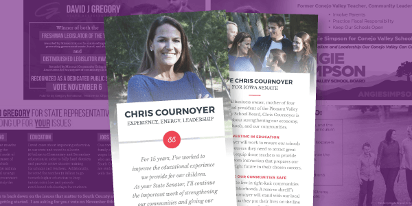
Whether you call them push cards, palm cards, cowboy cards, or push pieces, they are the most ubiquitous of campaign ephemera. Campaigns distribute them while knocking doors, walking in parades, or at local events. However, not every palm card is created equal.
When I first started out writing for campaigns there was a standard formula for palm cards. On one side you detailed the candidate’s biography. On the reverse, we’d put a laundry list of issues and shoehorn in tiney pictures wherever possible. This was an unmitigated horror.
Over the years, thankfully, the design of palm cards has evolved. Here are the three keys to a successful palm card.
1. Emphasize Images Over Text
I’d throw in a proverb here about how many words a given picture is worth. But that would be gauche.
As someone once said, the more you say (write) the less they hear. Or, my favorite proverbial corollary, the mind can only absorb what the seat can endure (Morton Blackwell…I think).
Limit your text to the essentials: Your name (conspicuous and everywhere), what you’re running for, the date of the election, your online information (website URL and primary social media handles), and your main campaign theme.
Trying to include your entire resume and every possible issue will create a sort of “text shock” in the reader, whereupon seeing a small card chock full of text, they simply throw it away.
High resolution, colorful images that tell a story will make the recipient more likely to read your card and remember you.
Take a cue from social media where posts that use visuals, rather than lots of text, tend to be more viral.
2. Choose Your Images Carefully
I prefer to use one large image per side of a palm card. This means for a standard, two-sided palm card you only get two pictures of the candidate. So, picking the correct image is imperative.
The candidate should be the star of the image, they should be easily identifiable and smiling. I’ve seen too many family photos where you have to search for the candidate. You’re not designing a Where’s Waldo challenge. Don’t hide the ball.
Pay attention to what story the images you use tell about your candidate. For example, if your district is demonstrating a strong anti-incumbent sentiment, avoid using pictures of your candidate dressed to the nines whilst the state capitol looms in the background.
Make sure they’re colorful. I want my cards to pop so they stand out. That’s why I like bright colors. I’ve seen plenty of emotional, compelling black and white photographs over the years. Save those for your memoirs.
3. Sync The Look Of The Palm Card With The Rest Of Your Campaign
The key to building brand awareness for a candidate is choosing the correct message and repeating it relentlessly.
Your palm card, digital messaging, and TV should not look like they were all designed by different people who’ve never met (even if that is, indeed, the case).
No portion of a campaign is an island. Everything has to work together to reinforce the campaign’s winning theme.
So, use the same color scheme, the same images, and the same text on your palm card that you employ elsewhere.
Voters will see you as more organized, serious, and professional while also being more likely to remember and internalize your key campaign message.
BONUS TIP!
Rely on the experts. The best thing you can do to ensure your campaign has a fantastic-looking, effective palm card is to let the award-winning graphics and copywriting teams at Victory Enterprises do the hard work. Get started with your winning palm card today.
Need more than palm cards? No worries, Victory Enterprises can handle all of your design and printing needs.