Over the years, I have designed thousands of yard signs for clients across the country. Without fail, a few candidates a year make bad choices about the yard sign they want. Here are the top five design mistakes I see throughout the year and how you can avoid them!
- Low contrast color schemes: You want the highest contrast possible on a yard sign, as they are often viewed in low visibility weather conditions or passed by quickly. If you opted for white elements on a yellow background viewer will struggle to make out the message. Strong, bold colors show the best.
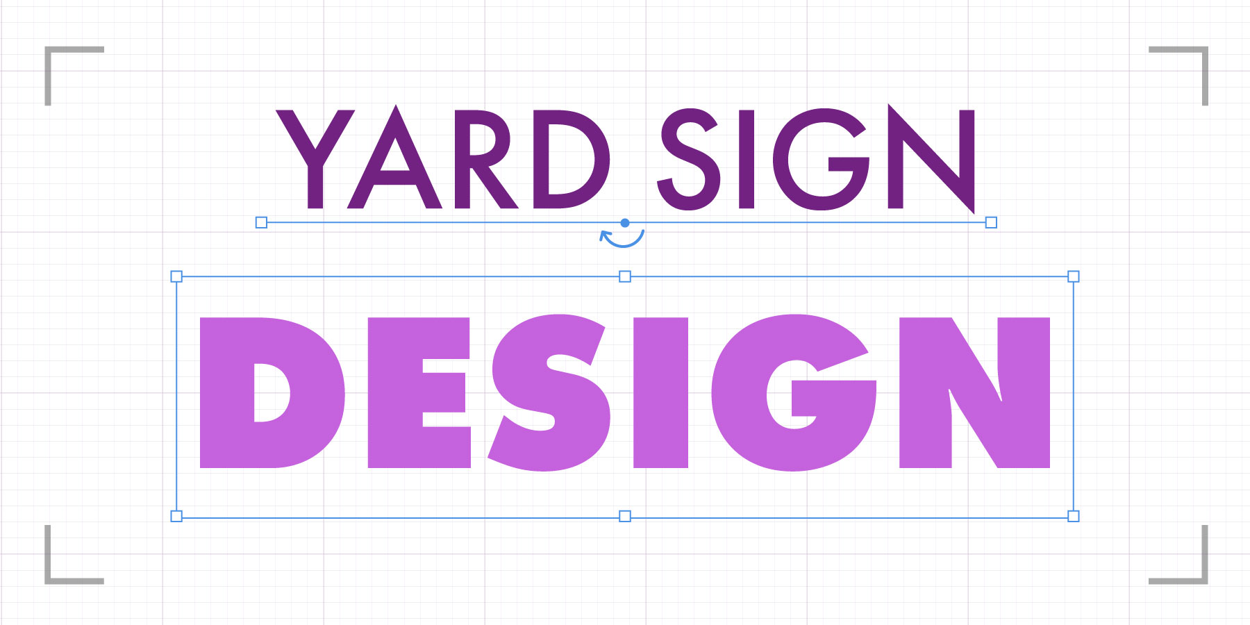
- Distorting Proportions: If you want to transfer your logo onto a variety of sign sizes, you may be tempted to stretch the design to fill the shape, but this creates distortion. A good designer can fill the space without compromising the quality of the logo. Avoid stretching elements to take up negative space and do not be afraid to have a secondary design that is still on brand but preserves the integrity of your sign.
- Being Afraid of Negative Space: Negative space is the area not actively filled with design elements. Let this shine and do not feel obligated to have every inch of your yard sign filled. Negative space can often make text easier to read by “letting it breath,” allowing the viewers’ eyes to focus in on the important elements and not be overwhelmed by trying to view too many elements at once.
- Too Many Details: Be Bold. Remembering that your signs will mostly be seen from the window of a car driving by. If you rely on small intricate details to get your message across, it will often be missed by your audience. Be concise. The most important part of your message is your name, so make this the focus and give them room to breathe.
- Inflexible Expectations: Your campaign is a brand and all major brands have alternative versions of their logo for different settings. (For example, it could be a personalized logo for a specific topic or a simplified badge logo to fit on a small item.) While needs change throughout the campaign, be prepared for small changes. You designer will be able to keep it on brand, set colors, typography and illustrative components and use those at different scales. An 8×4’ canvas requires a much wider design than a symmetrical 4×4’ sign, adapt your baseline logo to convey your message effectively and optimized for the medium.
Whether you’re walking in a parade with a big banner or speaking at an event with a small sign in front of the podium, you want all your signs ready to perform. By avoiding some of the mistakes listed above, you’ll be able to make the most out of your logo and signage, connecting your campaign with more people across the community.