
Write less.
I thought about ending the post right there, but I’ve decided that would be a tad too…meta. So, let me expound further on why writing less is the best thing you can do to improve your direct mail design.
In Strunk and White’s venerated polemic on good writing, Elements of Style, they lay out the most important rule writers in any medium should follow:
Omit needless words.
I first read that instruction in Stephen King’s On Writing. King lauds the wisdom of S&W’s dogma thusly:
The effect of judicious cutting is immediate and often amazing—literary Viagra.”
Ok, while you’re trying to bleach the “literary Viagra” images out of your brain, I’ll explain why this love of the minimal is even more important for political and campaign direct mail copywriters than for novelists and journalists.
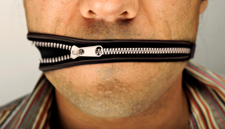
1) Direct Mail Marketing Is A Visual Medium
Remember the number one competitor your political direct mail is competing with is the trashcan.
Most people, even proven voters, don’t like junk mail. That’s why they swear up and down that campaign mail doesn’t impact their vote.
So, your mail has to grab their attention enough to prevent them from chucking it in the circular file long enough for them to get your point. To do that, you need to have compelling visuals.
People are drawn to visuals. Our brains developed/evolved to seek out images. Compared to visual communication (i.e. drawing and pictograms), written language is a new and artificial way of getting our thoughts across to each other.
If a reader is initially drawn in by your text, it’s probably a one or two word phrase that is in big, interesting font.
Give your potential readers a set of images and visuals in your piece that tell a story and evoke a specific emotion.
You might only get a few additional seconds, but if you’ve done your job that’s all you’ll need.
2) The More You Write The Less They Read
Avoid “text shock.”
Have you ever picked up a book or magazine with tiny type packed in tight stretched from margin to margin with little or no “negative space” at all?
When you did, I bet your brain hurt. I know mine always does.
Our brains are pattern recognition machines. That’s what written language is: Patterns of symbols we can interpret as meaningful communication.
Too much text just overloads the CPUs in our craniums and they tune out, preferring to move on to something more easily understood and digested.
You may think you’ve done a great job explaining you or your candidate’s fifteen point plan to improving health care for low-income voters [yawn], but no one will ever get to point 3…let alone the fifteenth idea.
Use the 30-second rule (although that may even be a bit much). If it takes a voter more than 30 seconds to digest your direct mail design…it’s just too long.
3) Your Direct Mail Design Is Not Your Dissertation
Listen, I know you want to impress your audience. I know you want to show your boss or candidate or target voters that you are intelligent and qualified.
Here’s the thing though: It’s not about YOU.
It’s just not. The only thing your campaign direct mail should be about is communicating the message you need the voters to hear in order to get them to support your campaign.
That’s it.
If your direct mail design is highly involved, in-depth, overly-technical, or high-prose then you’re missing the point and probably alienating the few voters who actually read through all of the tripe you just crammed in their mail box.
The most beautiful and impactful language is often the simplest.
If you’ve got million-dollar ideas…communicate them with ten-dollar words. More people will be willing to buy in.
So, there you have it. It only took me 600+ words to explain the key to good direct mail design: Write less. Show more.